Modern Edge Sports & Orthopedic Medicine Brand Identity
A bold, movement focused brand identity created to represent expert orthopedic care, sports injury recovery, and the drive to help patients stay active, pain free, and performing at their best.
Modern Edge needed a brand identity that felt as advanced and energetic as the care they provide. Wenning Branding developed a professional visual system that blends orthopedic credibility with sports performance energy, giving the practice a strong, memorable identity built around movement, recovery, and competitive edge.
A Brand Built Around Movement, Recovery, and Performance
Modern Edge Sports & Orthopedic Medicine helps athletes and active individuals bridge the gap between injury and recovery through expert, non surgical orthopedic care. The brand identity needed to immediately communicate motion, strength, trust, and medical expertise. Wenning Branding created a logo system and visual direction that reflects the energy of sports medicine while maintaining the professionalism expected from a healthcare brand. Visit Modern Edge Ortho
Sports Medicine Energy
A dynamic visual identity that feels active, fast moving, and performance focused.
Orthopedic Trust
A clean and professional brand system designed to feel credible, established, and patient focused.
Modern Edge Medical
A bold look that supports advanced care, innovation, and a forward thinking patient experience.
The Challenge
Modern Edge needed a brand that could stand out in the orthopedic and sports medicine space without feeling generic or overly clinical. The identity had to appeal to athletes, parents, active adults, coaches, and patients seeking expert care. It also needed to work across digital platforms, signage, apparel, promotional items, social media, and patient facing materials.
- Create a brand that feels athletic without losing medical credibility.
- Develop an icon that communicates motion, strength, and forward progress.
- Build a logo system that works in stacked, horizontal, and icon only formats.
- Use colors that feel bold, modern, and energetic.
- Create a visual identity that can scale across apparel, signage, web, print, and promotional products.
The Brand Strategy
The creative direction focused on the idea of finding your competitive edge. The brand needed to represent more than treatment. It needed to represent the confidence patients feel when they recover, return to activity, and get back to doing what they love. The identity combines a powerful athletic mark with a strong typography system and a medical performance color palette.
The Yellow Triangle
Represents energy, focus, direction, and strength.
The Teal Motion Figure
Represents movement, recovery, athleticism, and progress.
The Bold Wordmark
Gives the brand authority and visual weight.
The Clinical Descriptor
Clearly communicates the clinical specialty of sports and orthopedic medicine.
Overall Identity
The overall identity feels active, modern, confident, and professional, perfectly aligning with the goals of athletes and active adults.
The Logo System
Wenning Branding created a flexible logo system for Modern Edge, including an icon, stacked logo, and horizontal logo. This gives the brand the versatility needed for real world use across apparel, signage, digital marketing, patient materials, and promotional products.
Horizontal Logo
A clean, professional format built for website headers, signage, print materials, and wide format brand applications.
Stacked Logo
A balanced brand lockup ideal for square spaces, vertical layouts, and applications where the full brand name and specialty need to be visible.
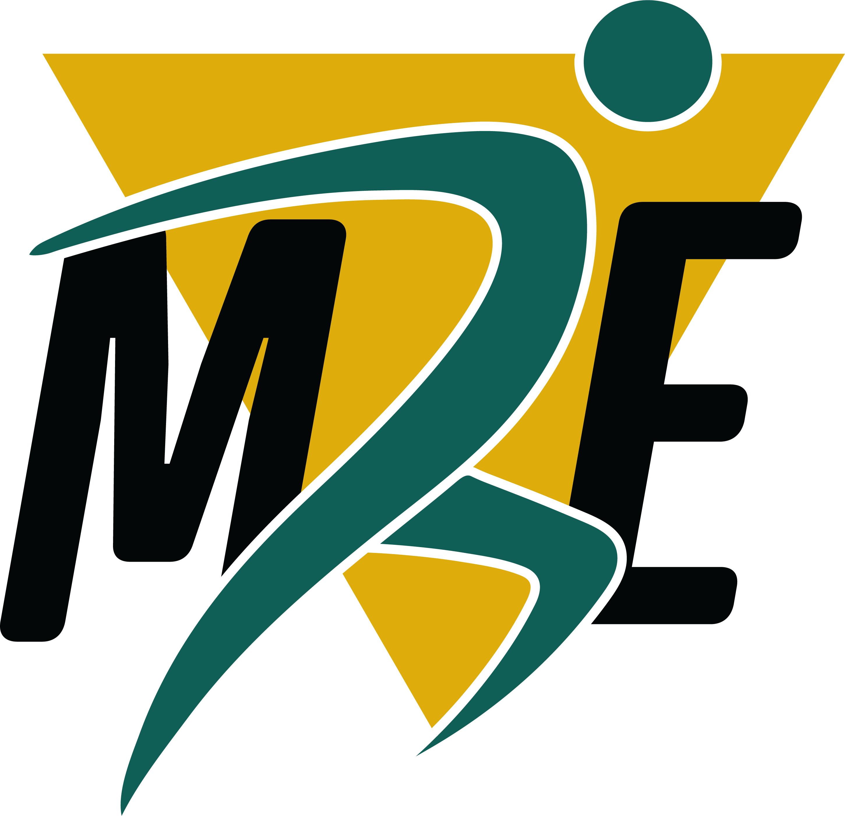
Icon Logo
A bold athletic symbol designed for quick recognition across social media, apparel, signage, and promotional items.
A Visual Identity with Athletic Momentum
The Modern Edge identity uses contrast, motion, and strong color blocking to create a look that feels both medically credible and performance driven. The deep teal brings trust and stability, the athletic gold adds energy and confidence, and the black typography creates strength and authority.
Typography & Layout
- Bold condensed headline typography
- Clean professional supporting type
- High contrast layouts
- Strong spacing
- Athletic visual rhythm
Color Palette
BUILT FOR REAL WORLD BRAND USE
The Modern Edge brand was created to work beyond a logo file. The identity can be applied across the full patient and business experience, from the website and office signage to apparel, uniforms, promotional products, social media, event materials, and sports medicine outreach.
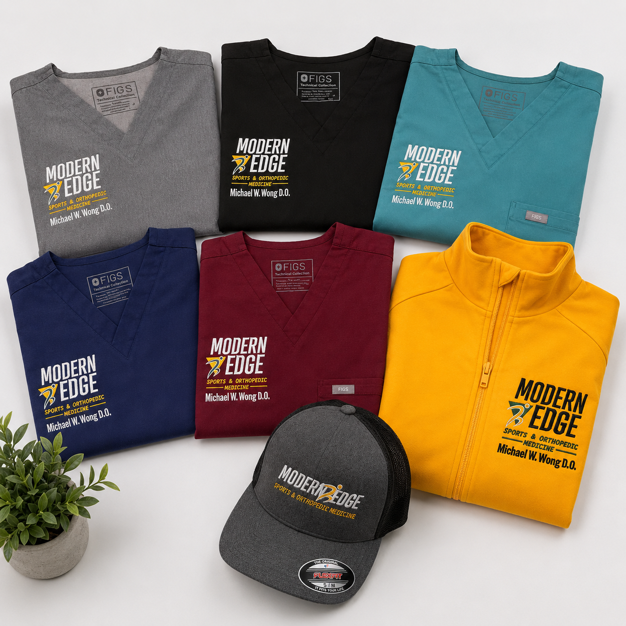
Staff Apparel & Uniforms
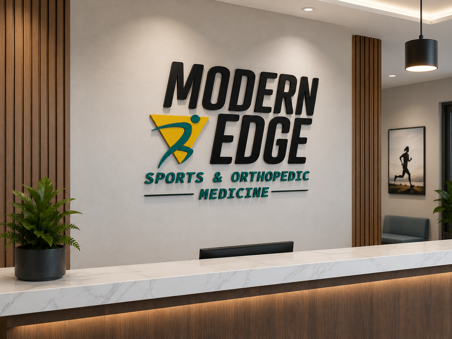
Office Signage
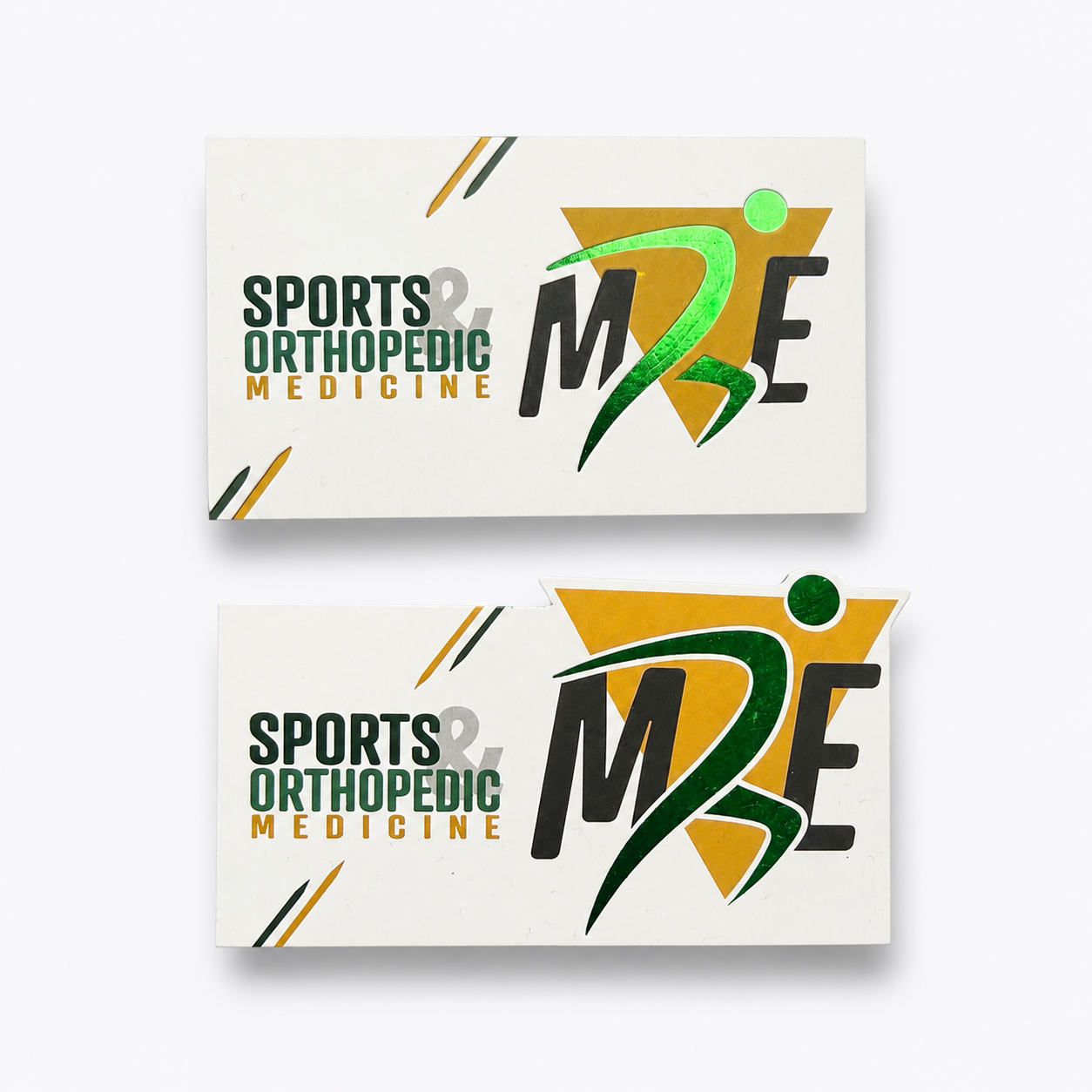
Business Cards
Website Presence
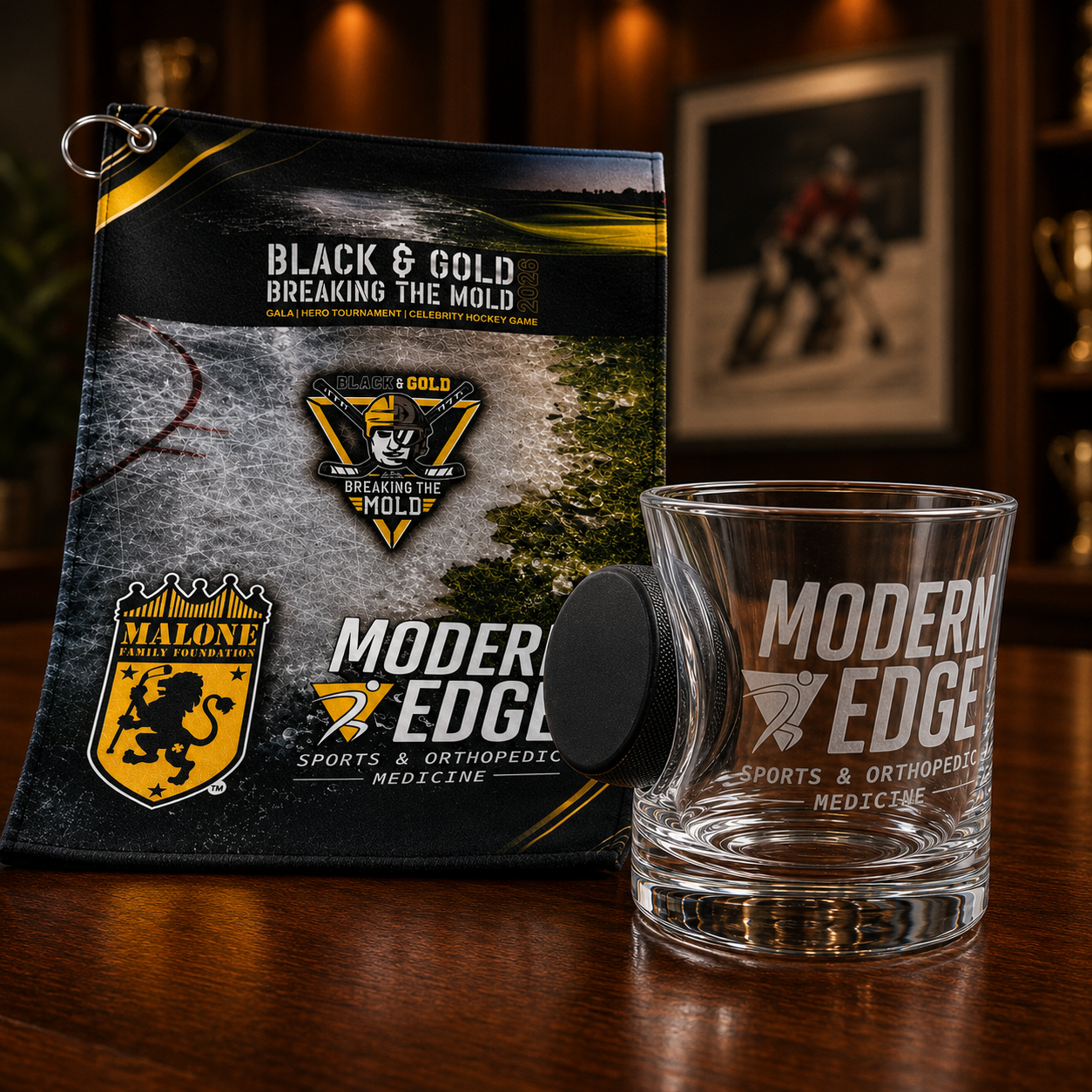
Promotional Products
Messaging That Supports the Mission
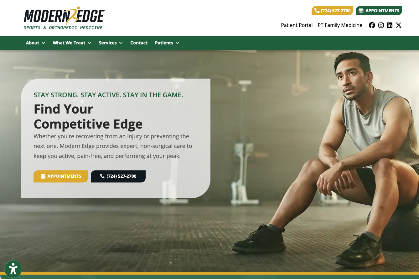
"Find Your Competitive Edge"
"Stay Strong. Stay Active. Stay in the Game."
"Expert Orthopedic Care for Active Lives"
"Recover Faster. Move Better. Perform Stronger."
The messaging direction gives Modern Edge a confident voice that speaks directly to athletes and active patients. It reinforces the practice’s focus on expert care, advanced treatment options, and helping people return to the activities they love.
A Brand Aligned with Their Services
Modern Edge provides treatment and services for sports injuries, joint pain, arthritis, sprains, strains, tendinitis, bursitis, fractures, work related injuries, PRP therapy, diagnostic ultrasound, corticosteroid injections, viscosupplementation, game day coverage, event coverage, medical consulting, and other orthopedic medicine needs.
The Result
The final brand identity gives Modern Edge a strong, recognizable presence that reflects who they are: modern, active, patient focused, and performance driven. The logo system creates consistency across digital, print, apparel, signage, and promotional applications while giving the practice a visual identity that stands apart from traditional orthopedic brands.
- A professional logo system with multiple usage formats.
- A memorable icon that represents movement and athletic performance.
- A bold color palette designed for recognition and energy.
- A flexible identity system for web, apparel, signage, social media, and promotional products.
- A brand direction that supports trust, care, recovery, and performance.
From Medical Practice to Performance Driven Brand
This identity helps Modern Edge show up with the confidence of a modern sports medicine brand while still maintaining the trust and professionalism of a healthcare practice.
Before
Needed a distinct identity that could communicate athletic care, orthopedic expertise, and modern patient focused treatment.
After
A bold and flexible visual identity that captures movement, strength, recovery, and the competitive edge patients are looking for.
Need a Brand That Looks as Professional as the Work You Do?
Wenning Branding helps medical practices, service businesses, and growing companies create brand identities that look polished, communicate clearly, and work across every platform.